
Thoughts on this font matching the original sign.....close enough?

 Junior Member
Thoughts on this font matching the original sign.....close enough?
 Senior Member
No one can see what your mpc really looks like unless they have the same fonts on their machine. A screen shot would be better.
 Senior Member
Instead of using centerline I would change it to raster, remove the feather and invert it. Might take a little longer to cut though.
Last edited by SteveNelson46; 12-07-2016 at 06:02 PM.
Steve
Junior Member
Thank you, I will give it a tryOriginally Posted by SteveNelson46

Junior Member
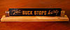
So this is what I came up with for the final product......the font is slightly off from the original but the recipients seemed to like them.
Member
The font may not be exactly the same, but it sure looks good!
Junior Member
Thanks Dale.
 Posting Permissions

 Reply With Quote