
Can you post an example?


 Senior Member
Can you post an example?
 CarveWright Staff
Sounds like a job for Chris Davis tomorrow.
CarveWright CX Packaged System - starting at $2000
CarversClub 1 Year Subscription - $150.00/year
Adv. Support w/out CC membership - $25.00/issue
CarveWright Community Forum - PRICELESS!
Junior Member
Here's a screenshot from designer 1.187 with 1" tall letters. The one that's highlighted shows the jagged vector path that the bit follows and you can clearly see the effects in the centerline rendering. The machine carves exactly what you see in the rendering. Larger or smaller size makes no difference.Originally Posted by DickB

 Senior Member
That is curious. True type fonts are not jagged. Why would the programmers introduce this "noise"? The situation in 2.0 is a little different I think. Things do look smoother if the size is increased.
(I think it all boils down to having to deal with the hardware problem of x tracking.)
 Junior Member
Pre 2.0 we did not have access to the glyph vectors in TrueType fonts. Now we do and can generate much smoother centerline paths. Here is an example of the centerline path generated in 2.007 for the same 1" tall 'A' as above and how it looks on the virtual board:
Keep in mind that the resolution of the "chips" on the virtual board are only 128/inch on a square grid, emulating/rendering at higher resolutions proved too slow for too many of our users computers.
Non-horizontal/vertical vector cuts will appear to have jaggies on the virtual board not present when carved on the machine, assuming a sharp bit and tight-grain wood.
Mark Anderson
CarveWright (10/28/2008 - 6/18/2014)
Junior Member
Well that answers a question I've had for some time on the specifics of the centerline improvements in 2.0. That gives me a bit more incentive to upgrade sooner. I had seen other screen shots where the 2.0 rendering didn't seem any better so it wasn't clear that the generated paths were much smoother. Thanks for the explanation.
Senior Member
Thanks Mark. Any thoughts on the original issue of this post?
 Junior Member
So from what you said here it can be assumed that all that jaggedness seen in the preview IS NOT seen in the actual carve and instead the lettering is very smooth? I would like to see actual examples of virtual board and the resulting carves of the virtual board since I have long wondered why a font carved with all that jaggedness that doesn't appear when you print the font at a large resolution. Like FWMiller, I have always found that the virtual board in 1.187 has been very accurate to what I'm going to see once carved and I've tried to find fonts that exhibit very little of the jagged lines. If I were to upgrade to 2.x based on this post I would expect my centerline projects to no longer have any very noticeable jaggedness once carved.
Custom Cabinets built with the help of my Carvewright - Custom Dart Cabinets
Please don't hi-jack threads and take them off topic.. it makes using the search function very difficult and doesn't help get your, or the original posters concerns addressed.
Senior Member
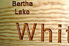
Sorry, I still don't understand what the fuss is about. This is a map I did so long ago I don't remember when with Designer 1. "Bertha" lettering is under 1/2" tall and "Whitefish" about 1-3/4" tall. Do you see any jaggedness?
Junior Member
Maybe I'm being overly picky about how Centerline carves but there is jaggedness is that image above that I will note is most likely not visible in the actual font glyphs. It becomes more noticeable on a carved board when you paint in the centerline carve with black paint for maximum contrast. I frequently have to spend 30 minutes or more cleaning up centerline carves with a dremel.
I just posted a new thread this morning asking for screenshots of a particular font. I had forgotten all about this thread from earlier in this year.
I noted what I would consider jaggedness added by Centerline that would not be present in your font file if viewed on screen.
Custom Cabinets built with the help of my Carvewright - Custom Dart Cabinets
Please don't hi-jack threads and take them off topic.. it makes using the search function very difficult and doesn't help get your, or the original posters concerns addressed.
 Posting Permissions

 Reply With Quote