-
 Centerline carvings is too faint.
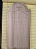
I'm working on a sign for our local vineyard and tried a small mock up version first, see attached image. I used Centerline for the text and it is barley visible. I had followed the street sign tutorial and carved that sign without any issues. Yet my attempt of text did not carve deep enough. I believe I had the settings correct ( conform on as, I'm carving to a region) and used the 90° bit. The font is Snell RoundHand Black. Board size is 12 x 6 x .75.
Any idea what I got wrong and if I carve the full size sign which is 18 x 11 will I have the same issue with the font?
Tags for this Thread
 Posting Permissions
- You may not post new threads
- You may not post replies
- You may not post attachments
- You may not edit your posts
-
Forum Rules


 Reply With Quote