
I wasn't sure where to put this. I just finished a welcome plaque and a few letters came out chipped. I have two sayings on this project one came out fine and the other had chips in it. Any suggestion will be appreciated .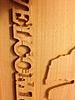


 Junior Member
I wasn't sure where to put this. I just finished a welcome plaque and a few letters came out chipped. I have two sayings on this project one came out fine and the other had chips in it. Any suggestion will be appreciated .
 Senior Member
Put up your mpc on here and will look at it some setting probely you did not doOriginally Posted by kcc2012

Henry
Every one has a photographic memory. Some just don't have film.
 In Memoriam
As henry says, we need to see the MPC.
However I have some things that might be considered, in this order.
1) Letters too much contrast.
1A) They are too deep for several reasons. Change the depth and height settings.
1B) Edit the text and increase the "Spacing" (I usually use a 10 or 12).
1C) You could, also, apply a draft.
2) The chips appear to follow the grain of the glue-up or the wood.
2A) Do the carve on different wood.
How is that for starters!
AskBud
AskBud Downloads =>> CLICK HERE
Lesson added 7/15/2012 Titles begin with "2D-3D Build a Pattern-Part-3"
CW Vacuum Head Project =>> CLICK HERE
AskBud Home Page =>> CLICK HERE <<=PC lessons or CW lessons
More than 1250 AskBud patterns vvv-CLICK BELOW-vvv
http://store.carvewright.com/manufac...ufacturerid=29
Junior Member
I'll put the mpc up in a couple hours when I get home. I'm on my phone right now and haven't figured out how to upload it.
Junior Member
Thank you. I did a test carve on pine and had a problem with all the letters on the pine, this one is on cedar (red cedar I think) I changed the font and only the welcome had the problem.
Junior Member
I stoped by the house real quick and hopefully got the mpc uploaded right. Thank you.
 Senior Member
you've got a couple of things going on there--
First, it'll help if you set the depth on your letters to the same depth as you carve region (.25)
Then you can set your height as high as you want it-- I don't recommend the whole quarter inch-- maybe about .15? Also, adding draft to the letters will help GREATLY with breakout.
Your Texas shape and lady (nice to see patterns that I put on here put to good use!) are nice, but the depths on them are a little funny as well. If you set the depth on the Texas at .2 and the lady at .2 and heights on both to 999 this looks better--
A little feather on your outside edge box carve region will also cut down on your carve time greatly.
I hope this helps, and here's my attempt for you if it'll help
Lawrence
In Memoriam
Your recess is a depth ot .250, and your text is .100 deep. Therefore, your text is actually .250 deep (it's trying to float, so it has to reach down the the .250 depth). If you just apply the (+) merge to that text, it may fix your problem. I would still increase the spacing.
AskBud
AskBud Downloads =>> CLICK HERE
Lesson added 7/15/2012 Titles begin with "2D-3D Build a Pattern-Part-3"
CW Vacuum Head Project =>> CLICK HERE
AskBud Home Page =>> CLICK HERE <<=PC lessons or CW lessons
More than 1250 AskBud patterns vvv-CLICK BELOW-vvv
http://store.carvewright.com/manufac...ufacturerid=29
Junior Member
Thank you both for the advice. I can't wait to get back home and work on this. Fishing and relaxing.
 Senior Member
A new bit too.... And if you used Draft then it cuts QUICK and SLOPPY..... Well... not really sloppy.... But if you select BEST it will slow down the cutting process. If you look at the grain of the wood, once the letters are cut, the wood looks flat saw and the grain lets go.... Hence the wood missing along the grain... That is why Pine worked better.... Tighter Grain....
And like everyone above has said.... Add DRAFT.... It makes a Volcano Look or side taper to the letters giving them more support. And DEPTH too.... The sign would look just as good at .1 deep ....
Good Luck,
AL
Favorite Saying.... "It's ALL About the Brass Roller"..... And "Use MASKING TAPE" for board skipping in the X or breaking bits.
Follow ME on Facebook http://www.facebook.com/pages/Accoun...50019051727074
www.PoconoDigitalWoodshop.com
www.AccountabilityTag.com
 Posting Permissions

 Reply With Quote